David Yurman
As part of an interview design challenge with David Yurman, I explored a redesign of their product card experience within the context of their broader website rebrand. The goal was to improve user experience and increase conversion across high-traffic pages such as their Product Listing Pages (PLPs) and Product Detail Pages (PDPs). This case study focuses on my design decisions, underlying rationale, and how I would evaluate the effectiveness of the proposed solution
Challenge

David Yurman is redesigning their website to enhance user experience as part of their rebranding initiative. Their product cards need to be reimagined to function seamlessly across high-traffic pages like PLP and PDP, ensuring an engaging shopping experience that boosts customer satisfaction and conversion rates.
Solution

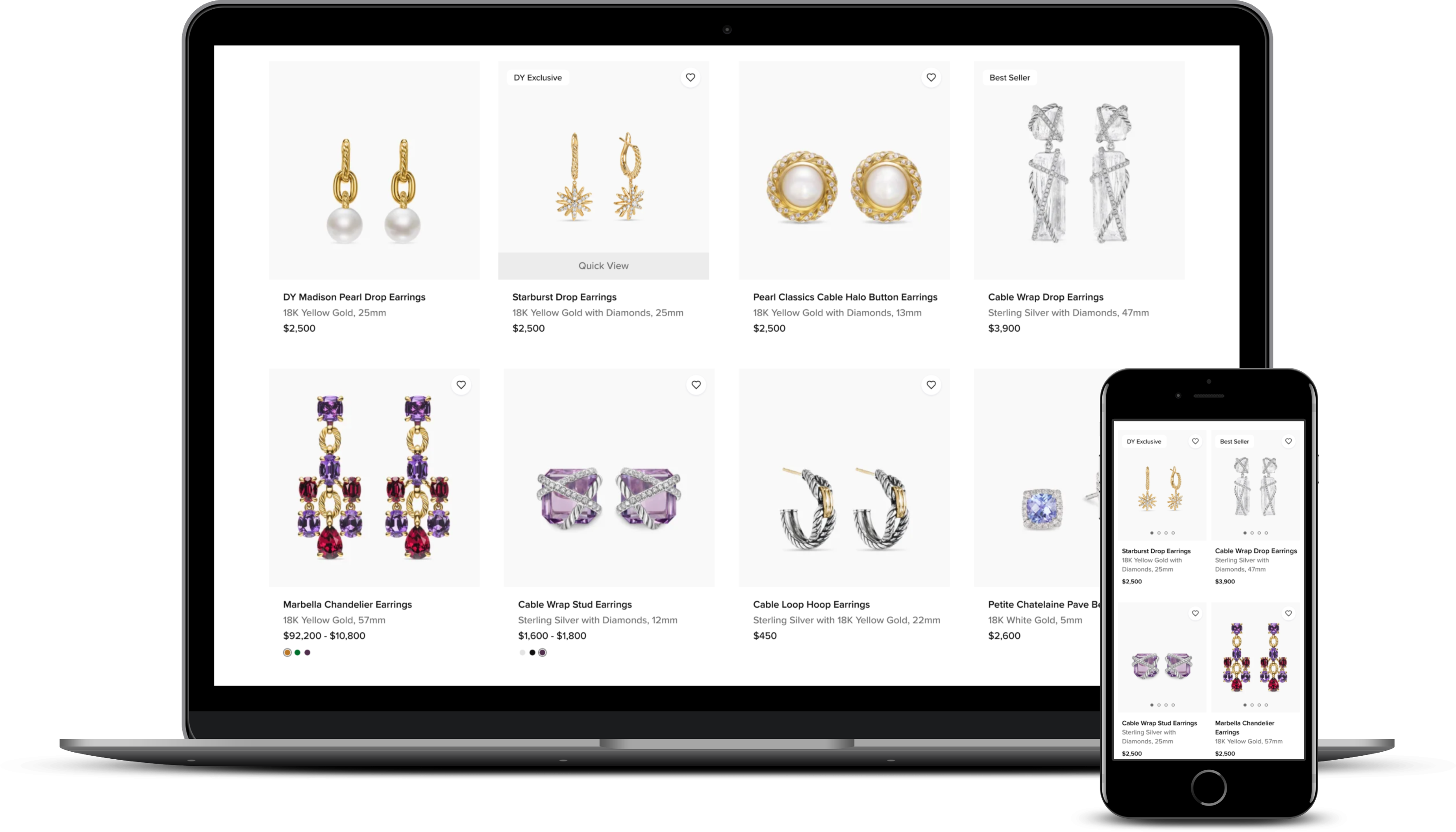
To tackle this problem, I proposed a design solution using UI/UX patterns optimized to increase engagement and conversion rates, including improved visual hierarchy for product descriptions, social proofs, enhanced microinteractions for accessibility, and clear CTAs.
Identifying Opportunities in Product Discovery

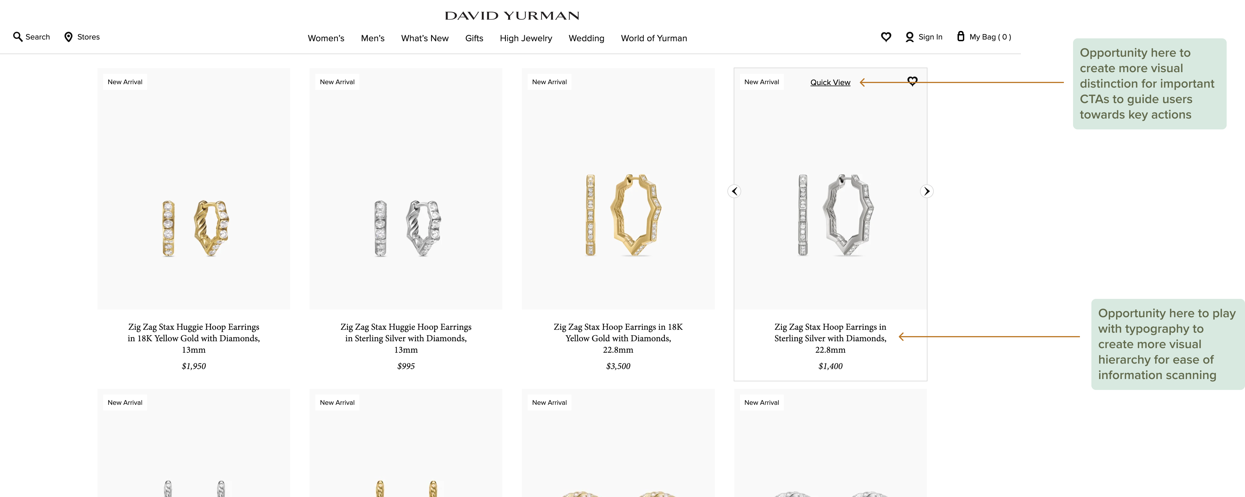
I evaluated David Yurman’s existing product cards alongside key competitors to assess how visual hierarchy and calls to action supported product discovery and purchase decisions. This surfaced opportunities to clarify product information and strengthen CTAs to better guide users through the buying process.
Defining User Needs to Guide Design Decisions

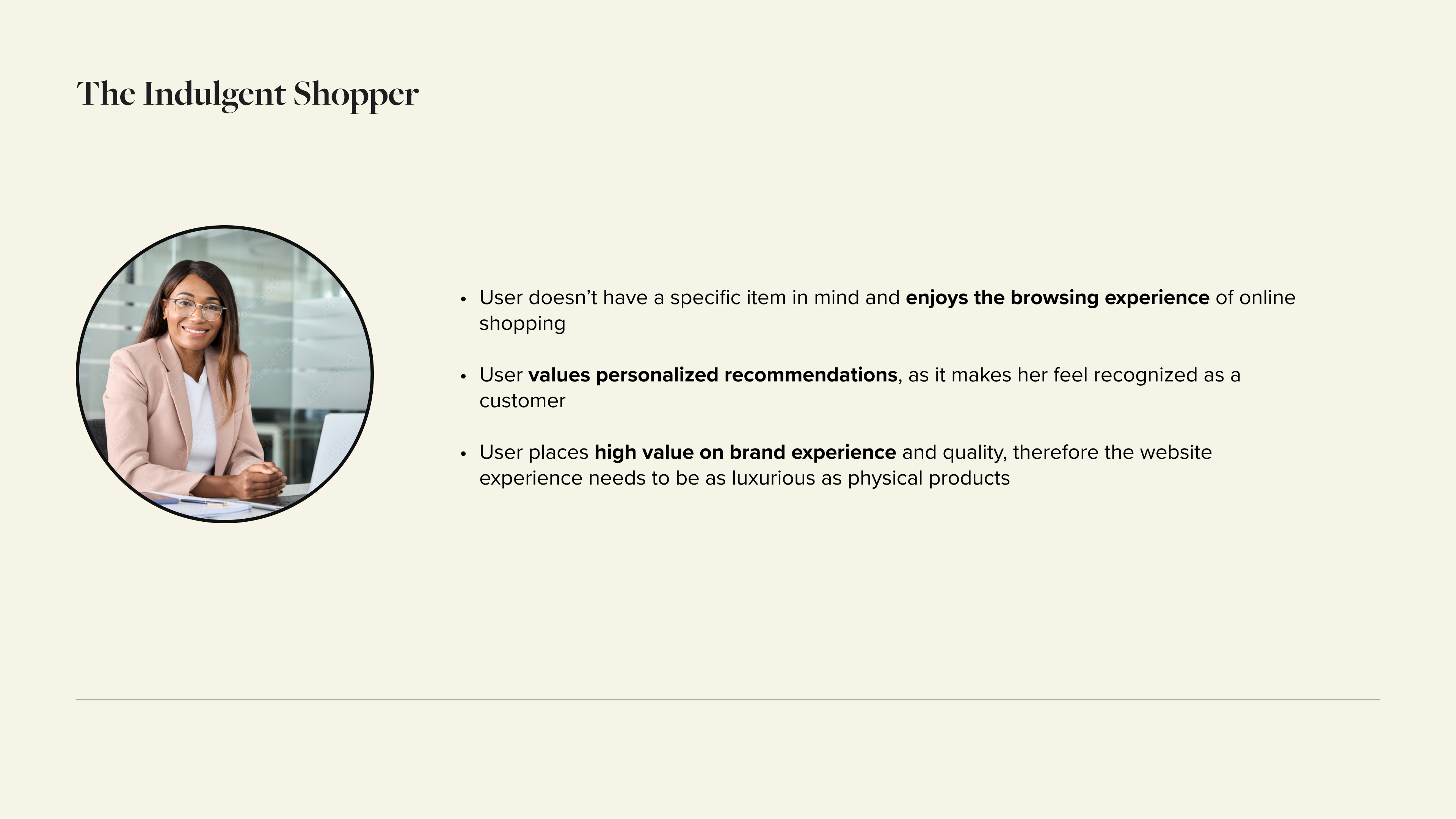
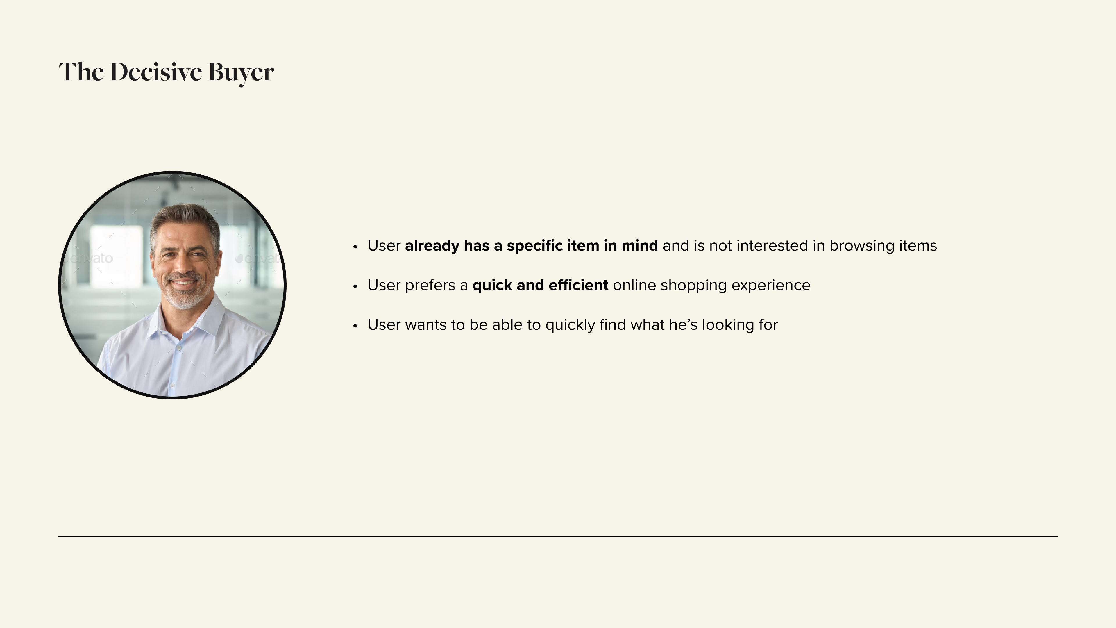
I developed two personas based on secondary brand research to ground the strategy in user needs. Clarifying their motivations and goals helped me evaluate design options and select the approach that best supported the business objective.
Exploring Design Ideas

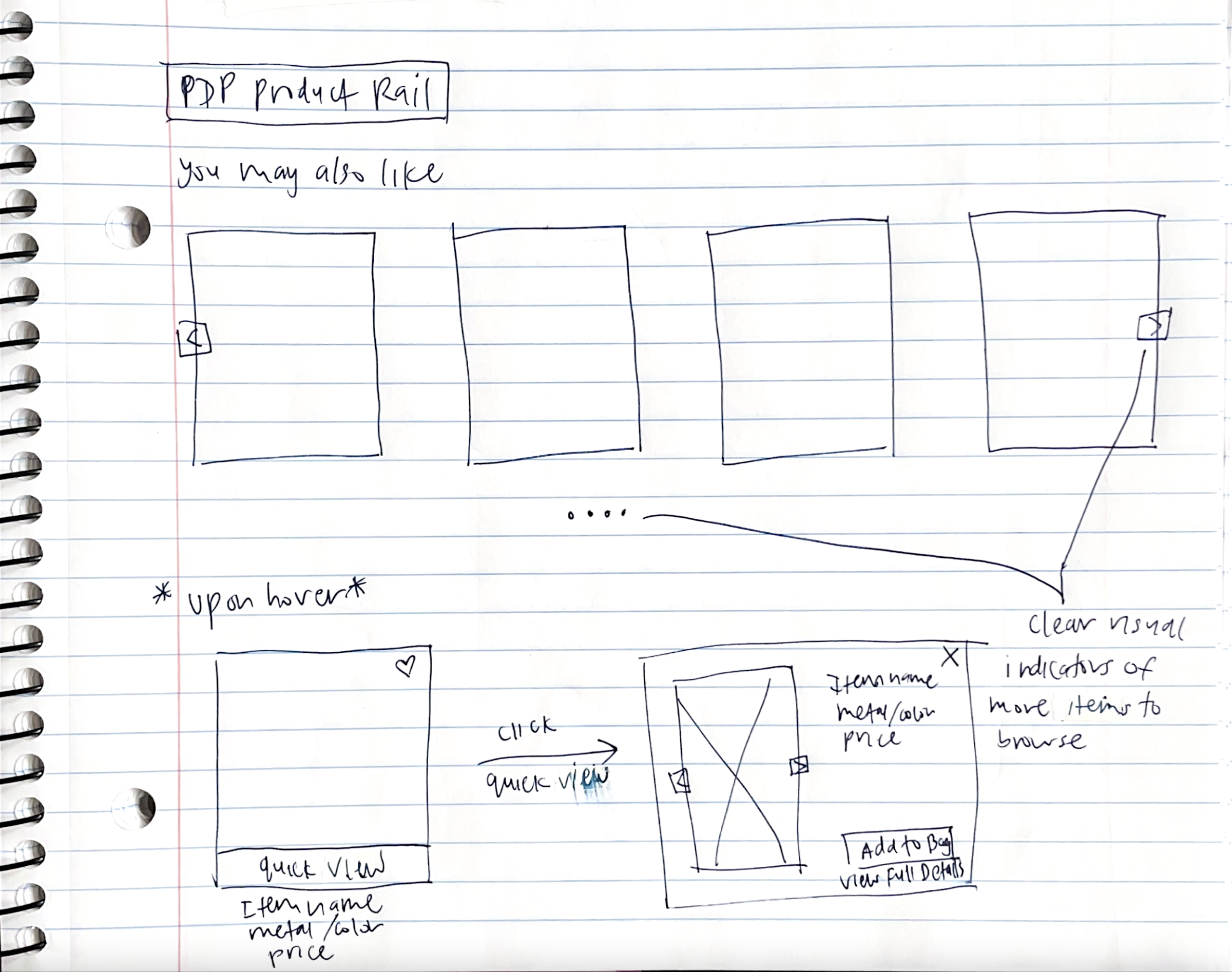
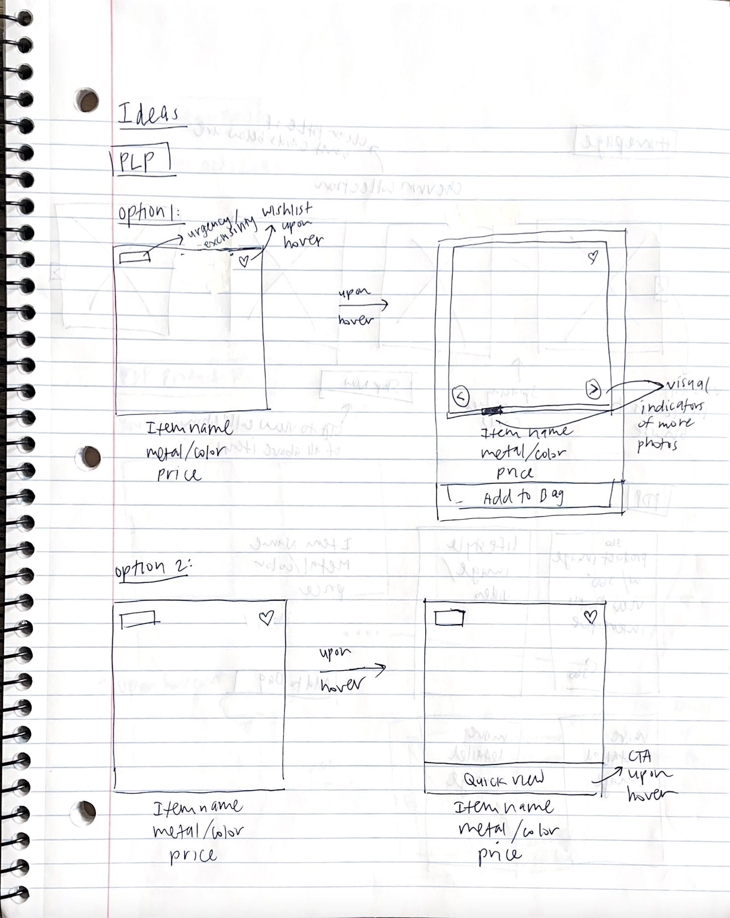
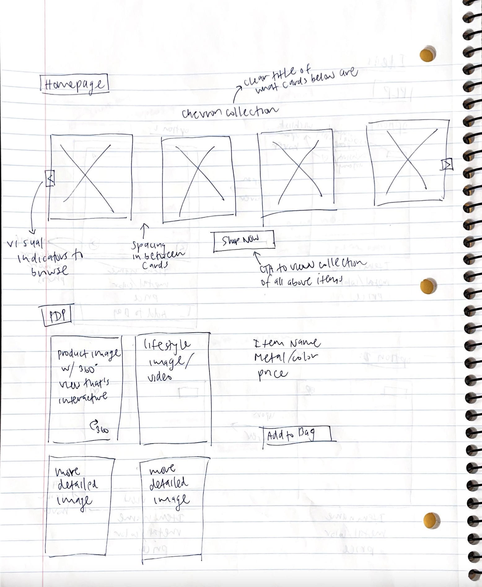
Focusing on the key assumptions made about each persona, I sketched out several ideas to address their needs. Ultimately, I refined my approach to two potential solutions, each tailored to the specific goals and motivations of the respective personas.
Evaluating Design Strategies by Persona

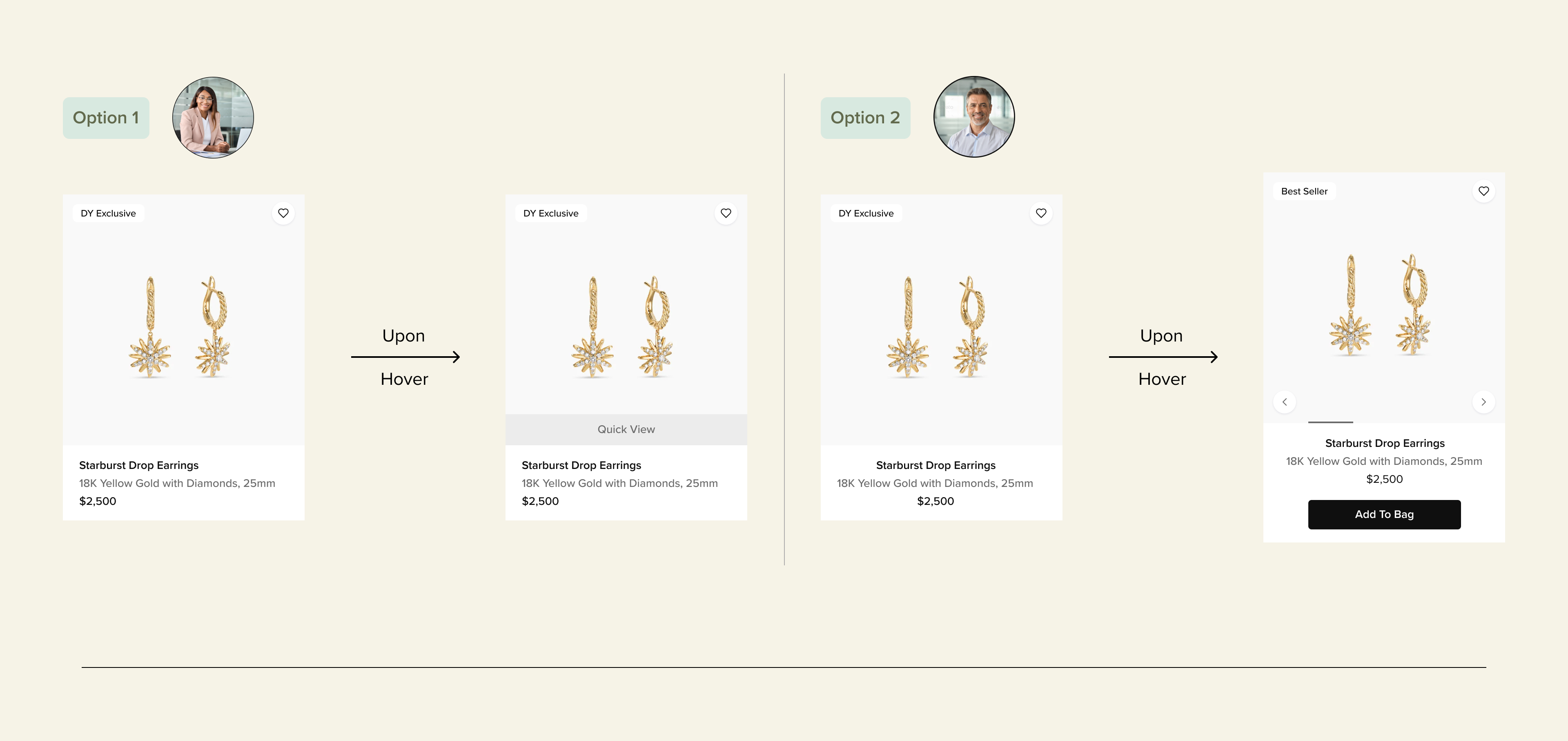
I narrowed my ideas down to two options: "Quick View" versus "Add to Bag" CTAs. So why choose different CTAs based on the target persona?
Quick View CTA
- Enhances the browsing experience so that users can have a closer look at the product without navigating away from the main page
- Presents more opportunity to incorporate brand aesthetic and storytelling
- Keeps users engaged by encouraging product exploration
Add to Bag CTA
- More emphasis on efficiency and ideal for the shopper that knows what they want
- Streamlined checkout process
- Effective for conversions, but less emphasis on the browsing experience that is ideal for luxury brand customers
My Design Recommendation to the Team

I ultimately recommended the Quick View approach because it supports brand storytelling while minimizing disruption to the browsing flow. Allowing users to view key product details without leaving the listing page supports longer browsing sessions and higher engagement, patterns commonly associated with improved conversion in e-commerce experiences. For luxury shoppers in particular, maintaining an uninterrupted browsing experience while reinforcing brand identity is key to building purchase confidence.
How Would I Measure Success?

- Conduct A/B testing on new Product Card designs and compare it to current design
- Utilize heat map/session recording tools to analyze user interaction and navigation patterns with new design
- Monitor relevant KPIs such as conversion rates, click-through rates, bounce rates for new versus current design
.png)
.png)